Locating Hog Waste Lagoons At-Risk for Toxic Overflow during Hurricane Florence
In the days before Hurricane Florence made landfall along the eastern shore of the US, multiple sources reported hog farmers in North Carolina frantically trying to drain open-aired lagoons fulls of hog manure in a effort to prevent any toxic overflows as a result of record rainfall. NPR interviewed a local river manager who expressed concern that many of the hundreds of these lagoons would contaminate nearby waterways. She described the lagoons as having a Pepto Bismol pink color, a hue caused by a prevalent type of bacteria in the lagoons. Sampson and Duplin county (mapped below) are at the center of what is refereed to as "Swine Alley," an area with the highest hog concentrations in the country. Using recent Sentinel-2 imagery and some basic supervised classification techniques, you can actually split water bodies into hog lagoons (because of their aforementioned distinct pinkish color) and all other water bodies. Focusing on these spots post-Florence. one could potentially identify lagoons that overflowed and contaminated their surroundings, and focus cleanup efforts to those areas. (Water bodies in the subset are colorized as pink and blue. The lagoons are pink but not that pink)

Flood Depth Estimations during Hurricane Harvey
Remote sensing is often used to perform damage assessments after major floods, but flood extent is only part of the story. Flood depth is also an important indicator for flood severity and damage, New methods from Sagy et. al,'s 2018 "Estimating Floodwater Depths from Flood Inundation Maps and Topography" offer a potential solution in areas with a relative high-resolution digital elevation model (DEM). This map used a 10-meter DEM and a post-Harvey Sentinel-2 image to test out the new methods. Red is less than one meter deep, dark blue greater than eight meters deep. The image was processed Google Earth Engine, and this scalable method could shed valuable insight into post-flood relief efforts.

Quick Walk Through of Google Earth Engine Beta GFS Four-Day Forecasted Rain Dashboard
This dashboard is meant to be a way to automatically ingest forecasted precipitation data and combine it with physical factors that may make a place more susceptible to flooding. Data for 62 African countries for four-day precipitation total (90th percentile pixel per country), percent developed (based on MODIS land cover), and average slope (based on SRTM derivations) can be found in the sortable table. Additionally, a simple risk example score has been calculated into the table, representing a novel approach to flood risk mapping. The dashboard updates itself as new forecasts become available, and displays the cumulative four-day precipitation total in millimeters on the map. If you click on the map, a small yellow dot will appear and an hourly four-day forecasted precipitation chart will appear in the panel. Users can hover over data points to find out the predicted rain at any given hour over the next four days. The panel will also display the total precipitation forecasted for the location during the entire four-day period. While this is a grossly simplistic view of flood risk mapping and the country-wide geographic units are inappropriate (and ineffective), this presents an automated, interactive, accessible, and free way to deal with potential flooding issues at a global scale.
Quick Walk Through of Google Earth Engine Beta Sentinel 2 Dashboard for Global Mapping of Water Quality Parameters
While working on my master's thesis to improve harmful algal bloom risk mapping, I had the idea to create an easy-to-use interface that would set up an automated workflow for algal bloom mapping worldwide. Although my research focuses on environmental and biophysical variables that create more conductive conditions for blooms, I realized the need for a better bloom monitoring tool and in-situ sampling is expensive and covers such small spatial and temporal scales. To alleviate this monitoring need, I made this dashboard with Sentinel 2A imagery that allows a user to zoom anywhere in the world, set a cloud cover threshold, and choose from a variety of image visualizations. You can choose a true color, false color, atmospheric, NDVI, MNDWI, water mask, chlorophyll-a, or suspended sediment concentration (SSC) visualization. If you are on the chlorophyll-a visualization, you can click on a water pixel and get the chlorophyll-a concentration. The atmospheric correction algorithm needs some refinement, but this tool has already been useful in locating waterbodies experiencing bloom conditions and could be used in the future to monitor hundred, if not thousands, of waterbodies remotely.
Google Earth Engine Landsat 5 Cloud-Free Mississippi Delta Turbidity Time Series
This is an 11 year time series of suspended sediment concentration (SSC) maps from the Louisiana Mississippi Delta. Using 58 Landsat 5 surface reflectance images, SSC was calculated to show the drastic difference in turbidity values during different seasons and precipitation paradigms. This script is a useful tool for making quick time series maps and sharing historic data with those interested in the region. The entire area is generally very turbid, but you can see images where heavy rains have caused expansive sediment plumes..
Interactive LULC Boxplots Based on County Percent Classes (Sorted by Percent Agriculture Low to High)
This is a code I wrote to analyze land cover and land use from the 2011 National Land Cover Dataset. The boxplots are built in Tableau from county land cover percent statistics within each state, and offer a ballpark idea of dominant land cover types. The graph is sorted based on the median value of county percent agriculture, sorted lowest to highest. At the top you see metropolitan and desert states that lack arable land, and at the bottom you see the "traditional" agriculture states that produce a variety of widely agrarian consumed foods and products. If you scroll over boxplots and dots you can get percent land cover values. You can view the Google Earth Engine code below.

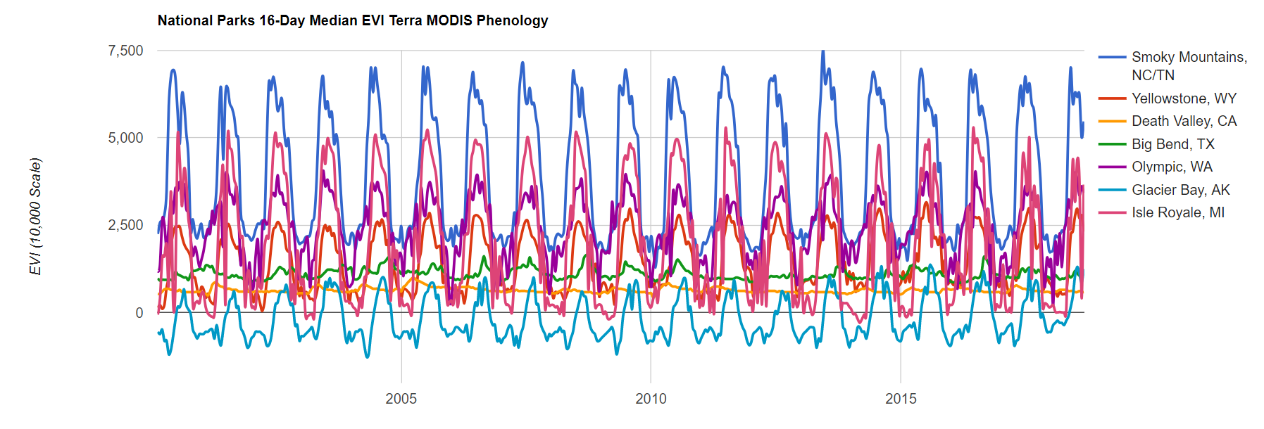
The National Parks Service hosts and maintains a diverse portfolio of parks, spanning across the continent and a spectrum of biomes. The chart below was created by taking MODIS-derived 16-day Enhanced Vegetation Index (EVI) images and calculating the median value for each of the listed park over the 15 year history of the data set. There are sharp differences in phenological cycles among the park, which are a proxy for the different climates in which they reside. Smoky Mountains, Isle Royale, Olympic, and Yellowstone NP almost all have the same phenological shapes, but with varying amplitudes. The transition from humid-subtropical to a humid-continental to temperate oceanic to warm-summer Mediterranean climate zones results in the visibly decreasing greenness respectively. Big Bend NP has a more sporadic phenological cycle as it is in a more arid region near the Texas-Mexico border where annual green-up and die-back is more driven by that years precipitation patterns. Death Valley NP, not surprisingly, does not exhibit much of a phenological cycle since it is a desert, and Glacier Bay NP, while exhibiting a clear periodicity, has a lower EVI than even Death Valley because it is mostly ice and as an extremely short "warm season" where vegetation can grow.